Overview
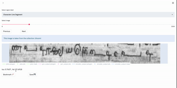
The main feature of the Box Supervision layout is the visualization of the model’s outputs it enables the user to have. The visualization plot offers a visual comparison to the ground-truth data for the same region. Refer to Navigation for more information on navigating between images.
The plot is interactive, and the user can select or de-select the outputs (polygons, points and masks). These outputs can be toggled from the legend of the plot, which has the color-coded labels for each output. Double-clicking a single output in the legend would hide all other outputs, and show only the clicked output. Double-clicking on an output twice would display all outputs simultaneously in the plot.
The plot also has features such as zooming in and out, panning and cropping. These options appear in the top-right of the plot, when the user hovers their mouse over it.
Shown below is a gif of how a user would visualize outputs for a region: